Brochure
Convention Brochure
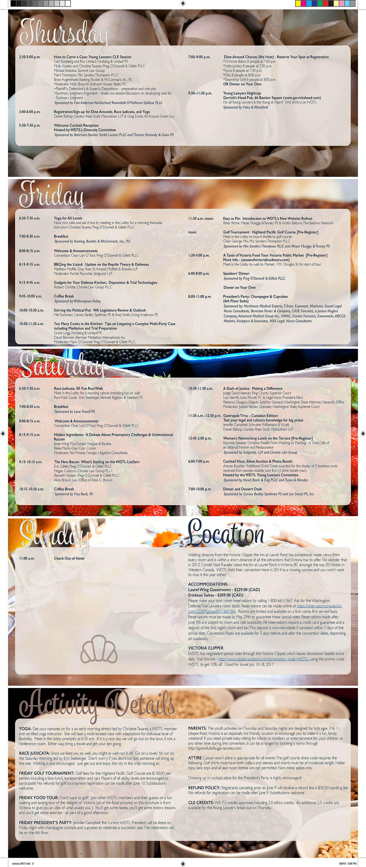
The chair of the event wanted to make it a food-themed convention brochure. Using the photographs of the foodie culture of Victoria, B.C., I weaved in the themes of food, drink and education. Using the idea of a cooking blog, I went for the soft, warm colors of the food photos and of Victoria – making it a delicious project to work with.
Postcard
Back to the Future Themed Postcard
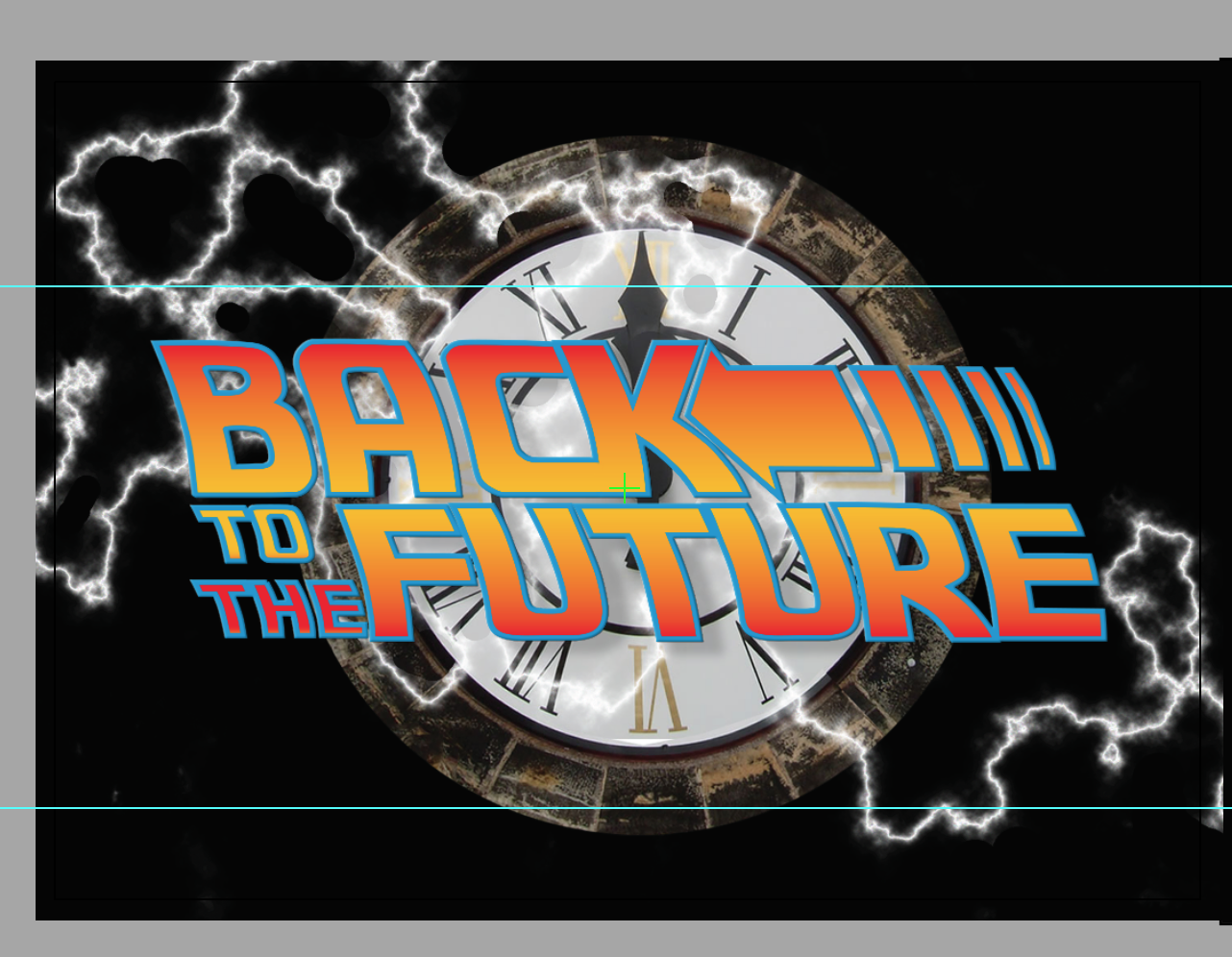
The chair of this lawyer’s convention wanted to have a throw-back themed convention around the 80’s – so it was “Back to the Future” where neon was king, and the music was ska. Using some the same lettering and images from the movie – we set the stage with the postcard – to be followed by the brochure – also in the same theme.
Advertisement
Real Estate Ad
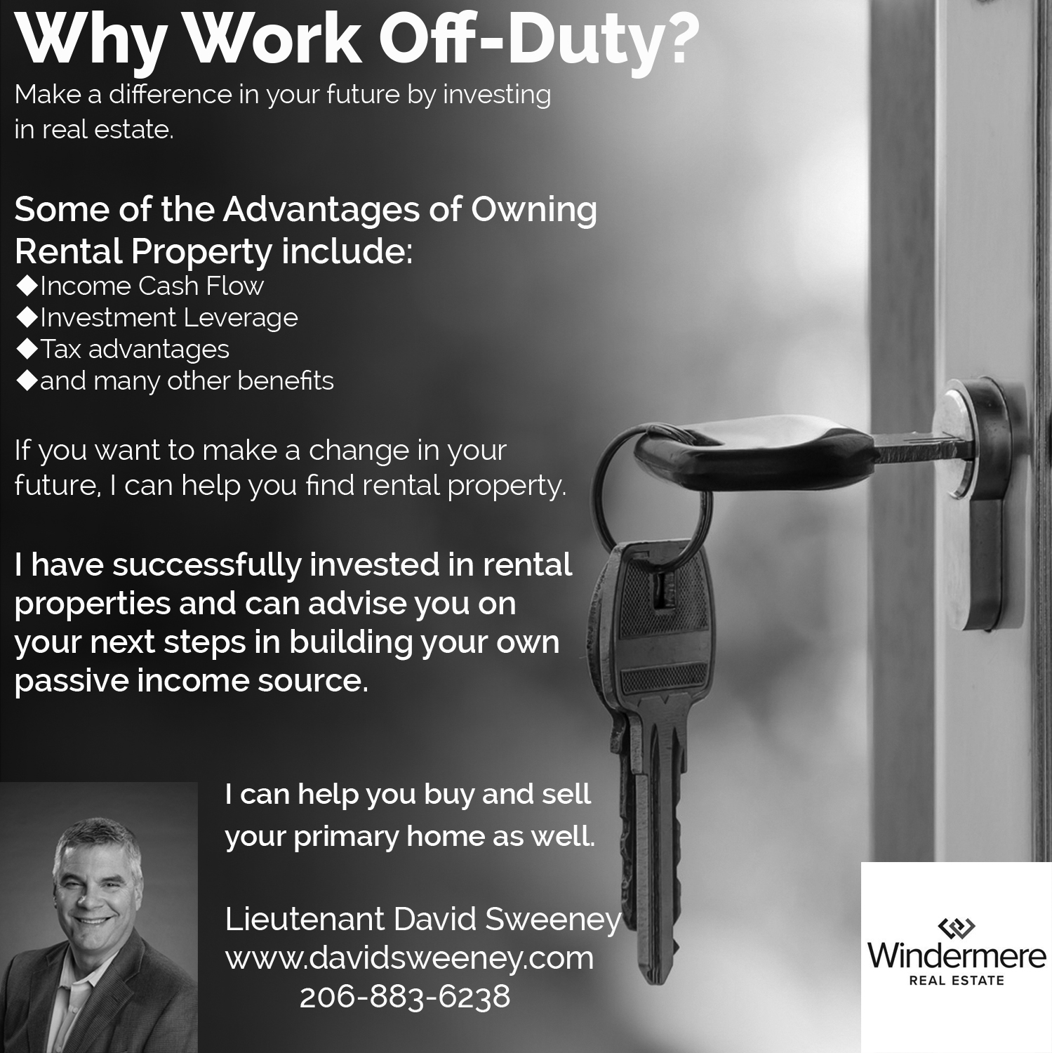
I needed to design an ad that stood out from the other real estate agent ads in a police newspaper and designing in black and white is always fun. David & I worked to convey the sense of peace that buying a home can bring, along with plenty of space for all of the copy. He’s a great agent and one of the most honest man around – so if you are in the market for a house – https://www.kw.com/kw/agent/davidsweeney
Website
Energy Engineering Website
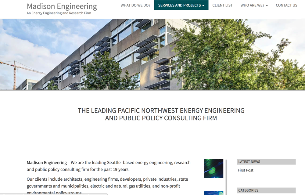
Madison Engineering wanted a new look and feel to their website and incorporate some of the photography of the projects. I did a competitive analysis and worked with the client to create a more approachable language. CSS coding of particular functions and colors to the site including sepia effect when clicking on some pictures and shadow effect.

Business Card
Business Card & Email Template
The law firm was getting a new exciting webpage and needed to have their business cards and email templates reflect the new branding. Working with the firm administrator – designed a new branding look and feel that reflected the webpage so that the branding was consistent. Email template also was made to work within Word so that the attorney could add text as needed.
Website
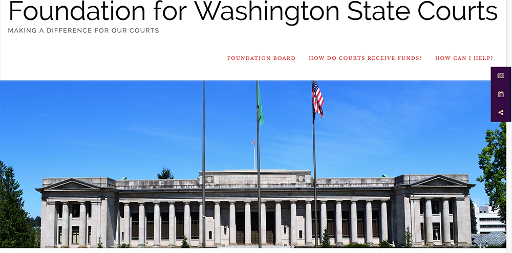
Foundation for Washington Courts
When I redesigned the Foundation for Washington Courts Website (I did the original design in 2008 and it hadn’t been updated much since), I worked with the executive committee to address some functionality and loading issues, surveyed their end user and went back to a redesign of the logo as well to fresh it up – using the same original plum color. With the donation of some lovely photography by Celeste Stokes of courthouses around the state, I think we captured some of the essence of the importance of this foundation (buying equipment and funding some critical capital needs) – http://fwacourts.org/